Tuesday, March 27, 2007

week 11: grids in bills at the NCGA

At the General Assembly, the documents I produce all have a simple grid structure, with four basic horizontal frames:
1) top of bill, includes the year of session, edition number, bill number, and history.
2) sponsor's name(s), separated by a horizontal line
3) committee referral (if any), separated by a horizontal line
4) text of bill, separated by a horizontal lines

All bills at the North Carolina General Assembly (of which we have produced over 2,500 this year) have the same identical structure, so the document is easily identifiable. Members, staff, and lobbyists all are used to the same structure, which was used in an identical manner when I got here 30 years ago.


Posted by Picasa


UPDATE March 28, 2007:
Wait a minute, here's the document I should have posted, since the instructor is on the SILS faculty! Notice that one of the grid segments (sponsors) expands in size to fit the contents:

Friday, March 23, 2007

week 10: Activity centered design: online portfolio


ONLINE PORTFOLIO MANAGER AT USATODAY.COM:
Easy enough that a caveman can do it?

My activity centered design is setting up a portfolio at USAToday.com to track my investments. I know that a lot of news websites offer this feature to encourage site loyalty, but I did not know if USAToday.com offered one.

Sketching out the steps
I assumed the activity would begin with:
1) locating my holdings
2) getting the correct names of the stock and mutual funds
3) Finding out how many shares I wonder, and possibly even date of acquistion if the site tracked historical values
4) figuring out the stcok symbols, hopefully there will be a lookup engine
5) finding the feature at the website

and end with worrying even more about my holdings, rather than being blissfully ignorant of the stock market.

I hope that it will be easy!
------------------

Actual steps:
1) go to USAToday.com website

2) make a guess that the feature will be at "Money" so I click on the green Money menu bar on the upper left, getting me to the Money front.

3) Nothing on the first page visible, so I scroll down and just below I find:


Posted by Picasa

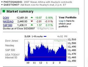
Interesting way to present this. How did they get my portfolio already?? :)

4) I reach the instruction page by clocking on "log in here" and get:
"Welcome to USATODAY.com’s Portfolio sign-in page
Please choose one of the following:
1 - If you already have a USATODAY.com stock or mutual fund portfolio, sign in here.
2 - If you are a new user, start here to create your free USATODAY.com stock and mutual fund portfolios.If you don’t receive a confirmation e-mail in a timely manner, check your SpamFilter or Junk Mail folder. In some cases, Confirmation e-mails will get caught there. When you find it, just click on the link to confirm your registration.If you have a question or a problem, please go to: feedback.usatoday.com. "

5) I click on "new user", put in my selected user name and password, and go off to await a verification email.

6) By the time I log into my email, the verification email has already arrived. It avoided my spam filter. Yay! Here's what it says:
"Thank you for signing up for a USATODAY.com Portfolio! Please validate your e-mail address by clicking the link below in order to activate your Portfolio. [link deleted] If you are unable to access the above link from this e-mail, please copy and then paste the URL into the address field of your browser. If you do not confirm your e-mail address your Portfolio will not be achieved.Please Note:If you received this in error, and were not creating an e-mail address for your Portfolio on USATODAY.com.com, please accept our apologies. Disregard this e-mail and the Portfolio will be deactivated for this e-mail address after 15 days. "
Well designed!

7) click on the link, page returns "Thank you, your e-mail address has been successfully validated. Click here to log in"

8) Log in is easy, next screen is part 1 of 3 (as opposed to the wedding announcement page at the Roanoke Times that had six steps and my classmate thinks will drive off users) and I think most investors are willing to go through three steps


"Create a Portfolio (Step 1 of 3)

1 Enter a Portfolio Name:
You can have up to 10 portfolios. Create one at a time.
Choose a cash position preference: No cash position Cash position Initial Cash Amount $
About the Cash Position This is optional. Choose a cash position if you want to start your portfolio with a specific amount of money. Then, the initial cash amount you enter will change as you "buy" and "sell" stocks in your portfolio. "

[cash position, hah, it's too late in the month] This page is well designed for the user.
I name my portfolio "Gerry" and tell it I have $45 in cash (A $20 bill, $20 worth of the new Washington dollars, and five ones)

9) I'm at step 2:

"Create a Portfolio (Step 2 of 3)

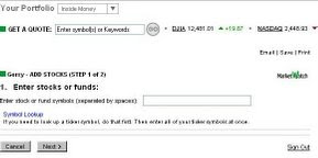
2 Enter stocks or funds:
Enter stock or fund symbols (separated by spaces):
Symbol Lookup "[good, a symbol lookup, but this assumes some level of knowledge, what's a stock symbol?] "enter all of your ticker symbols at once. " [ouch, poor design, I'm going to have to write them down, can't cut and paste one at a time, poor design] .

Here's the lookup feature entry point (click on picture to get magnified view):


Posted by Picasa


here's what I try -- "Disney", this returns "DCQCL - NYSE" this can't be correct, NYSE has one, two or three letters, so I try "Walt Disney" and get DIS, "United Parcel Service" and get UPS (sounds right), "Marriott" and get
MAR
Marriott Intl Inc New; and finally a mutual fund, "Evergreen" and get a list of 100 funds, find the correct one
EABFX
Evergreen Asset AllB FUND

so now I have gathered DIS, UPS, MAR and EABFX, back to the entry screen
Bad, I've wandered off somewhere, there seems to be no link back to the portfolio creation screen, try back three times, there it is.

type in DIS UPS MAR EABFX

10) I'm at step 3 and get this screen with the holding names prefilled, and it asks for purchase date, # of shares, and purchase price. (I don't know the purchase price, I'll try leaving that blank for three of the items, and I'll put in dates on two. I'm making up all this info. I then hit the "finish" button. I wonder why if I give the purchase date of the stock, their database can't look up the value on date of purchase?

I discover there are lots of different views to choose from, as well as "create custom view" "launch portfolio tracker" and "download to spreadsheet"

Process completed. here's one view of my fictitious portfolio (click on picture to get magnified view):


Posted by Picasa

ACTIVITY CENTERED DESIGN
Using Saffer's analysis structure, I'd say the USAToday portfolio trakcer is an Activity-Centered Design. The designers focused on the tasks at hand, not on how the user would interact with them (User centered design). There were clearly a few steps NOT well user-tested, especially entering the ticker symbols and understaning the process involved. There were no easily visible help options. The location of the feature had very little emphasis on the site. Still, an attractive option for users. It would appear that USAToday.com had outsourced the production of the online protfolio to marketwatch, which might have caused some of the problems with integrating my progress through the process with where I was on the site. Interesting the outsourcing, I think one of the other class blogs for this week noted that the newspaper obit site they were searching had outsourced the feature to legacy.com.


Friday, March 16, 2007

week 9: banner created

Posted by PicasaWent into photoshop, took the image that I had on the earlier post and used it as the image for my banner, color picked the Carolina blue, reduced the opacity to make it lighter, added text in Onyx after picking the same dark blue color, added the border from Rameses, and uploaded it here. Now, I need to figure out how to make it the banner on the top of my blog.
By the way, the Carolina Blue border spilling into the letter "O" of "OLINA" was not intentional, but is a good transition and pulls you into the banner.
UPDATE: Done! Just went on my dashboard to "Page elements" and linked to the picture, it's now my banner. Someone had suggested I get rid of the awful color at the top of my blog, so I edited my CSS to get rid of that image, and it was replaced by the Rameses color.

week 9: My palette

Posted by PicasaI had to reinvent the wheel. In my post below, I showed how I modified the CSS of my blog to incorporate three colors from a picture that showed my emotion (Go Heels!) I forgot to actually create and post the palette I used. I went back to the picture, used color picker, and of course I couldn't remember exactly where I had picked the colors, so I got close -- you will notice that the color hexadecimals are not the same as listed in the post, but they are close enough for government work. I went into Photoshop, watched Serena's tutorial, and voila, palette above.
UPDATE: I am sort sort of moron. I had posted the exact hexadecimals for my three colors in an earlier post. In photoshop I just needed to paste these into color picker and I would have had the EXACT colors. Oh, well.

Friday, March 9, 2007

Carolina blue palette

I took the image from my last post, pasted it into Photoshop, cropped it and magnified it to show the individual colors. Highlighted here are several shades of blue (with Carolina blue in the lower right), and some of Rameses.
Posted by Picasa
I started with one of the readings for this week "Create a template color scheme using a photograph" I took an image, and posted it to my blog so you can see what I started with. I then pasted it into photoshop, cropped a small area, blew it up, did a screen print, pasted it back into photoshop, cropped it, and saved it as a .jpg. This is my color palette, which I also posted to my blog per instructions. Back in Photoshop, I used the eyedropper, and sampled Carolina blue (a5bede), the darker blue border (102049) and Rameses (8c9684). I cliked OFF web colors only. I went into my blogger account dashboard, and went to edit the html on my template. Under body, I edited the background hexadecimal to be background:#102049; deleting a linked .jpg file as well. This is now my outer border, the deep blue. For Rameses, I added a subtle thin wrapper
#outer-wrapper { background-color:#8C9684;
then to get the main emphasis for my blog, Carolina blue, i edited in my main color
#wrap2 { width:700px; background:#A5BEDE;

I did not change any of the widths in any of these settings, and deleted any extraneous linked background files.
wow, I've edited my CSS
UPDATE:
Well, I finally got around to watching Serena's two tutorials on how to create a color palette, and discover I did it a different way and did not actually post my palette to my blog, so next week I'll go back and post my palette (as opposed to posting a swatch of the origin photo above!) I'll probably go and add the silver from the school colors to my pallette as well!!)

week 9: when I die I'll be a Tar Heel dead

I'm going to be using the colors in the photo above as the basis of my color palette
Posted by Picasa

Tuesday, March 6, 2007

week 9 word: migration

Posted by Picasa

week 9 word exercise: expansion

Posted by Picasawell, I just installed a trial version of Photoshop (first time using any image manipulation program) and here is my latest word exercise.

Saturday, March 3, 2007

Module 9: word exercise: elimination


Modification of earlier post to do elimination as one word

Module 9: word exercise: elimination and migration


Coldtype: not a rock band (ems and ens)

I'm old enough to have set movable type (I always called it coldtype, which was wrong, coldtype was a later development) by hand on a printing press in 7th grade shop class (circa 1963).


As opposed to the monospaced font used in manual typewriters (Design Basics Index p. 238), most modern fonts have different widths for characters. When you set movable type by hand, grabbing individual characters out of a box and putting them in the composing stick, the width usually did not fill up the line, so you'd grab ems (blank metal the width of the letter M) and ens (blank metal the width of the letter N) out of the box to justify the line. When it was full, you took the locking tool to tighten your type, put it on the press, inked the pads, and let-er rip.


ems and ens in CSS

Nowaways, ems and ens have a different meaning, and have infiltrated CSS:

from Web Content Accessibility Guidelines Working Group

em: The foremost tool for writing scalable style sheets is the "em" unit, and it therefore goes on top of the list of guidelines that we will compile throughout this chapter: use ems to make scalable style sheets. Named after the letter "M", the em unit has a long-standing tradition in typography where it has been used to measure horizontal widths. For example, the long dash often found in American texts (--) is known as "em-dash" since it historically has had the same width as the letter "M". Its narrower cousin (-), often found in European texts is similarly referred to as "en-dash". The meaning of "em" has changed over the years. Not all fonts have the letter "M" in them (for example Chinese), but all fonts have a height. The term has therefore come to mean the height of the font - not the width of the letter "M".
In CSS, the em unit is a general unit for measuring lenghts, for example page margins and padding around elements. You can use it both horizontally and vertically, and this shocks traditional typographers who always have used em exclusively for horizontal measurements. By extending the em unit to also work vertically, it has become a very powerful unit - so powerful that you seldom have to use other length units.
From wikipedia:
"An "em-quad" is a metal spacer used in printing presses. It is referred to by this name because it is composed of a square one em on each side. In these old-fashioned printing presses, this allowed the insertion of an em space( ) character between other typographical characters. It is also occasionally referred to as a "mutton quad".
The with of the em space ( ) is defined to be 1 em, as is the em dash (—) (more commonly used in American texts). By contrast, the narrower unit en (more commonly found in European texts) is half an em.
Online, the use of the em measurement has become more common; with the development of Cascading Style Sheets (or CSS), the W3C best practices recommendations within HTML and online markup now call for web pages to be based on scalable designs, using a relative unit of measurement (such as the em measurement), rather than a fixed one such as pixels ("px") or points."

Thursday, March 1, 2007

CDC en espanol


I've posted a critique of the Centers for Disease Control (CDC) English language website. The CDC website is available in 10 different language. A screen capture of the Spanish language version from February 27, 2007 is posted above. Interestingly, while the basic layout is the same as the English language version, and also contains just four pictures, the CDC headquarters shown at the lower right of the English version is not on the Spanish version, replaced instead with a warm picture of an Hispanic family prominently at the upper left. The Spanish version also contains a horizontal link bar to versions of the site in 10 different languages, a feature missing from the English language version.