
Benetton's message audience is both world-wide and limited, designed to appeal to those interested in social justice and environmental issues. While this may be niche marketing, those in that niche are highly motivated, and having demonstrated attachment to a strong political and social cause able to transfer that loyalty to a brand in toudh with the buyer's ideology.
Benetton says in its 2003 Annual Report that its business model is based on three factors: brand awareness, a symbol of Italian temperment and Italian effort, giving the products added value in style and quality of life; innnovation; and quality of product, offering extra in identity, innovation, and attention to detail.
Benetton's corporate website says "Benetton is present in 120 countries around the world with a strong italian character whose style, quality and passion are clearly seen in its brands: the casual United Colors of Benetton, fashion oriented Sisley and the leisurewear and streetwear brands Playlife and Killer Loop ... Creating added value for the brand: this is the aim of United Colors of Benetton corporate communication. It contributes to creating the image of a global enterprise that invests in research, is modern and projected towards the future, emphasising its principal and most important characteristic: uniqueness ... Benetton has a long history of attention to ethical values and involvement in social and cultural initiatives. Perhaps the most visible are our institutional campaigns, touching social themes of wide international significance and often in cooperation with renown international organisations. Our social commitment, in fact, goes beyond these campaigns, with initiatives of both international and local impact. "
Thursday, February 8, 2007


Wednesday, February 7, 2007
Week 5 Branding: Benetton: Image/Metaphor
left: credit: Ko(char*)hook's photostream
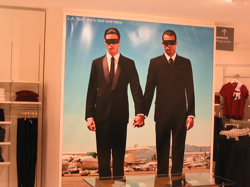
Benetton social issue ad
I have chosen Benetton as my brand.
Benetton image is both multicultural and Italian at the same time, seemingly inconsistent. Benetton products are a metaphor for wearing chic clothing while at the same time rejecting capitalist consumerism. Through Benetton's long standing (former) advertising campaign of speaking out on social issues like AIDS, or using photos of a black woman breastfeeding a white baby, with no mention of the product being sold (other than "United Colours of Benetton"), Benetton has been a metaphor for pursing social justice while still looking good.
Friday, February 2, 2007
Week 4 culturally laden signage: Lady Liberty

America's entrance sign is the Statute of Liberty (left). Located in New York Harbor for over a century, it is a beacon to immigrants and (other than Tiger Woods) America's most recognizable symbol. It is a  symbol, the New Colossus of the Western Hemisphere, with Emma Lazarus' poem of that same name
 symbol, the New Colossus of the Western Hemisphere, with Emma Lazarus' poem of that same name
illustrating the many metaphors much better than I: "Not like the brazen giant of Greek fame ...Here at our sea-washed, sunset gates shall stand
A mighty woman with a torch, whose flame
... From her beacon-hand
Glows world-wide welcome ... cries she
With silent lips. "Give me your tired, your poor,
Your huddled masses ... I lift my lamp beside the golden door!"
A mighty woman with a torch, whose flame
... From her beacon-hand
Glows world-wide welcome ... cries she
With silent lips. "Give me your tired, your poor,
Your huddled masses ... I lift my lamp beside the golden door!"
Of course, being America, it has been appropriated as a sign and symbol for commercial purposes (right) by the New York New York Hotel and Casino in Las Vegas, where tired and weary gamblers and sinners are also welcomed by Lady Liberty (1/3 scale).

image source of Statue of Liberty: http://www.cr.nps.gov/worldheritage/images/Statue_05a.jpg

image source for NYNY Hotel in Las Vegas: Flickr Creative Commons http://flickr.com/photos/martinrp/334489122/ photo by .Martin
Thursday, February 1, 2007
Week 4 Metaphor: You've failed

The red x inside a square is a symbol, a metaphor for failure on the internet. The user has tried to post an image, but the link is dead or the upload failed. The "x" is well understood as meaning "no". It is symbolic because it bears no relation to the nonexistent image. It is soundly designed because it can not be mistaken for what it is not. It is successful at communication because it has either been seen or happened to all of us, and inserts itself at a place on a webpage where an image is expected. Except, of course, on this post.
week 4 A sign that does not work: Adult Swim panic
 Designed to promote the Turner cartoon Network "Adult Swim" program, hundreds of one-foot tall signs placed in major cities across the United States in the last three weeks caused panic in Boston on January 31,2007, unprecedented since the 1930's Orson Welles' produced "War of the Worlds". The illuminated signs, illustrating the Mooninite characters from the popular Cartoon Network program and resembling crude 1980s era computer graphics, the devices, with their protruding wires, were mistaken as bombs and shut down the city. By combining different images (a cartoon character recognizable to a small segment of culturati and wiring that appeared to many to be a bomb) the designers created a sign mistaken as a terrorist threat.
 Or did the signs, perhaps, work exactly as the designers had hoped? One could not have bought as much national publicity for the show.
week 4 signage: public usage
 This public usage signage (taken from the South Plainfield New Jersey recycling website) clearly conveys how to dispose of tangible objects, place them in a trashcan. The user is clearly a human, taking the act of placing a tangible object in a trashcan. A human will know that the force of gravity will cause the object to drop into the can. The objects are simplified from the actual, blurring design elements, racial differences, and sex. The sign is clearly inconic, all three items are easy to interpret because they resemble the thing they represent.
Friday, January 26, 2007
week 3 emotional design object: Beetle bud vase
 The Beetle bud vase is an example of behavioral design, it enhances the pleasure and effectiveness of the car it is built into. The vase is mounted in the middle of the dashboard, and it has been said to give you "... a warm feeling about Volkswagen and the experience of buying a Beetle." It personalizes the car, and gives you both a common feeling of being a Beetle owner while letting you choose your expression based on what you put into the vase. It "evokes positive emotion about the product". The design element incorporates a common artistic object (the vase) into a wholly differential product (an automobile).
image source: flickr Creative Commons http://farm1.static.flickr.com/87/234068684_cbe0bb45fc.jpg?v=0

credit: Captain Oblivious
Subscribe to:
Posts (Atom)